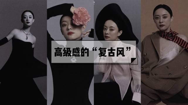
Classical In recent years, it has become especially popular. The dressing style of many grandma generations is now even more popular. It can be seen that fashion is a circle and it is real!And the retro-style interpretation, in addition to our common Broken flower, lace, silk scarf, contrast stitching , What are the more low-key retro styles that show the sense of quality?
Sun Li’s latest set of blockbusters is a good example for everyone. Although the whole set of blockbusters is very unsuitable for her, it also makes it rare for Sun Li to completely overturn the blockbuster filming, but only look at the combination of single products. It is a very high-end interpretation of retro style.
Large area of black
In the past, we mentioned retro style, in terms of color matching, Most of them are some high-bright contrast colors, such as red and blue, the whole body powder Wait while For the high-end retro style In terms of color, the choice is this Large area of black Best what we call “advanced”
Black itself is a color that can highlight the aura. Although it is low-key, it is very prominent in visual effects, especially for All-over black dress In other words, it magnifies the effect of the whole body to the extreme, and for the interpretation of the whole body black, if you want to show a high-level retro sense, it can also have fashionable highlights, you need Pay attention to the highlight of the sense of hierarchy !
The word sense of hierarchy has really been emphasized too many times in a outfit, and it can show a clear sense of hierarchy. Color matching and style matching The above can be done, because we emphasized the black shape this time, so if we want to show the sense of hierarchy, we can only reflect it through style matching.
Simply put, it is to show through two ways of wearing…
Dress style
For a black dress shape, if you want to show a sense of hierarchy, you can pass The design of the collar , Overall silhouette To reflect, such as the neckline of the tube top, the skirt of the umbrella skirt, these are very good levels of display, and in Accessories On top, like shoes decorated with some crystals or broken diamonds, it can also play a finishing touch.
Matching of top and bottom
For the combination of tops and bottoms, if you want to reflect the sense of hierarchy, you can Revealed by the obvious contrast of the large silhouette ,such as The top is loose and the bottom is tight, the top is short and the bottom is long , Even the combination of short sleeves and trousers is the most simple and direct way to show the sense of hierarchy.
Because it is a black shape, so in order to highlight the highlights of the whole body, we Need to make some finishing touches on the accessories , Such as colorful accessories or some bright spots in the details of the clothing itself, and the whole body is matched with a large area of black, it will be more perfect.
Large area of white
Similar to the principle of black, if black is the most aura of the color, then white is the cleanest and purest color, but in the advanced retro style, white represents the full atmosphere and dignity.
In the color matching, white needs to have a clear primary and secondary relationship with black. Because in the overall shape, white will be the protagonist, so a small area of black is fine, but Pay attention to the sense of unity , If there is black in one of our outfits, then there can’t be only one part with black, and the other parts should be matched with some black.
For example, if there are black stitching on the skirt, then you can add some black on the neckline and sleeves…
but if Black as an accessory Appeared, such as a black top hat with white clothes, Correspondingly, the color of the bottom garment is preferably black , So that you can have a unified feeling of upper and lower, and with this combination, the black area is definitely larger than the white, but in terms of visual perception, the white is still the protagonist.
Disclaimer: The text is original, the picture comes from the Internet, if there is any infringement, contact to delete it. Plagiarism is prohibited, offenders must be investigated!
Text/smile

You must log in to post a comment.