The iPhone in the concept does not have a ‘rabbit ears’ but instead is a protrusion at the top of the device to house the necessary components.
Apple introduced the “notch” design for the first time in 2017 with the iPhone X. At that time, the “notch” design was subject to a lot of “criticism”. Many people think that this design loses the symmetry of the iPhone’s appearance.
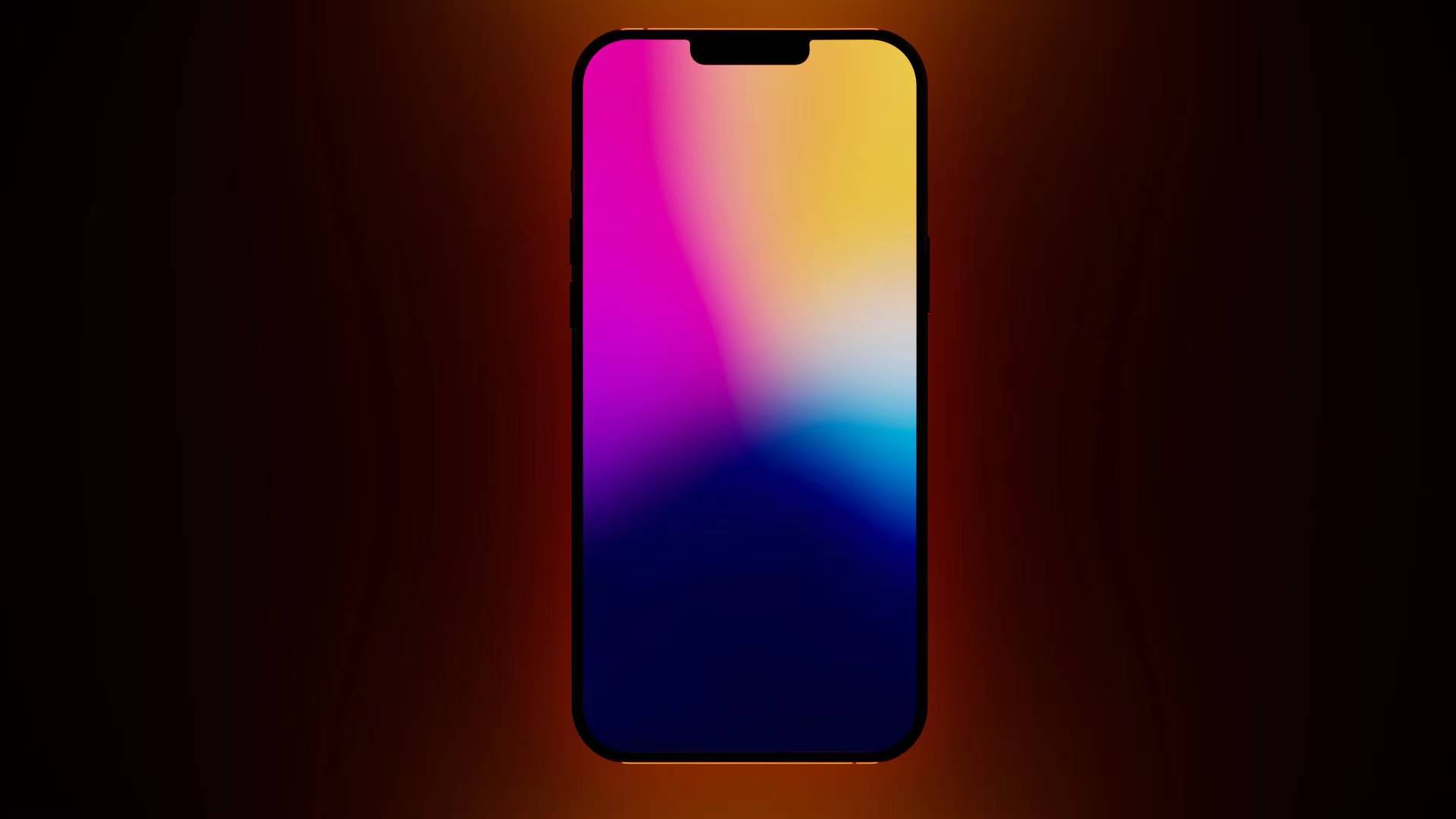
Up to now, many reports have suggested that Apple will gradually reduce the size of the “notch” on the iPhone and proceed to launch an iPhone completely without a notch. Until then, a designer named Antonio DeRosa has introduced a rather new iPhone design concept that also eliminates the “notch” on the front of the iPhone. Antonio DeRosa calls his design the iPhone M1.  The iPhone M1 in Antonio DeRosa’s picture has absolutely no notch. The screen border of the device is also almost completely minimalist. (Photo: Antonio DeRosa)
  The device has a front camera arranged hidden under the screen in the center above the screen. Meanwhile, other components needed for the operation of the phone are arranged protruding at the top of the device. (Photo: Antonio DeRosa)
  This approach to the design leaves the user’s screen space unaffected. (Photo: Antonio DeRosa)
  A close-up of the top of the device is quite unique in the design of the iPhone 11. This phone still has a flat beveled side. (Photo: Antonio DeRosa)
  The device is equipped with a cluster of four cameras on the back. (Photo: Antonio DeRosa) Please read and see more pictures of this special iPhone in the video below:











You must log in to post a comment.