Small-sized new houses are now favored by homeowners. Their small and exquisite area is not only relatively affordable, but also convenient for daily cleaning and maintenance. This is undoubtedly a very good choice for families who just need to buy a house! But everyone knows that the design of small-sized storage space has always been a headache. The indoor area is small, and every square meter of space is precious. In order to make reasonable use of the space, homeowners frequently make coups, such as the following homeowner. .
What I will share with you below is an American-style small home with two bedrooms and one living room. With an area of 86 square meters in the whole house, the indoor area is even less after deducting the public stalls. However, the owner did not make the space appear bright and bright through “subtraction” like others did. Instead, he made a lot of cabinets indoors. This is the same as the owner. The previous experience is related, and the homeowner has a deep understanding of the worries about the lack of storage space after moving in. Therefore, the decoration of this new house pays special attention to storage space, the whole house is elegant and beautiful, especially the design of the master bedroom closet is really ingenious and very practical! Can’t help but come and share with everyone.
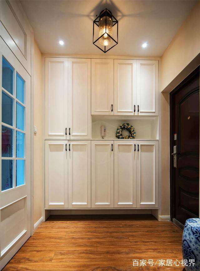
In terms of space layout, this new house with two bedrooms and two halls is quite square. Although the layout is compact, the movement is distinct and has a sense of hierarchy. The top shoe cabinet is designed on the right side of the entrance, and the kitchen is directly opposite. The whole space is open-planned. The entrance and the guest dining room are connected as a whole, and the space is transparent and light. The bottom of the shoe cabinet on the right is left blank to highlight the sense of hierarchy and make it easy to change shoes.
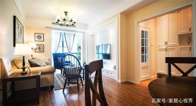
Walking along the entrance is the guest dining room space. The guest dining room designed by Latong is mainly light-colored walls and warm-colored floors, with stylish and atmospheric chandeliers as embellishments to give people a warm and comfortable visual experience. The warm-colored wooden floor covering the ground expands the space visually. The color of the whole living room from the top to the ground changes from light to dark, which is full of layers and three-dimensionality.
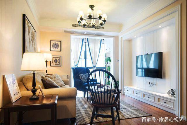
The TV wall in the living room is different from other designs made of plaster wire and other materials. During the decoration, the homeowner boldly uses the built-in TV cabinet to decorate the wall. The overall “embedded” design does not take up space. The cabinet at the bottom can also meet the storage needs, beautiful and practical ! In addition to storage, the embedded TV countertop can also be decorated with ornaments, which serves multiple purposes.
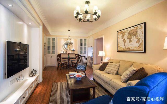
The background wall of the warm color sofa is similar to the fabric sofa. With a dark coffee table, the overall fashion and atmosphere of the American style is continued. The warm color wall and the lively color sofa pillows give a sense of petty bourgeoisie’s sophistication and style. From this point of view, the restaurant is very transparent!
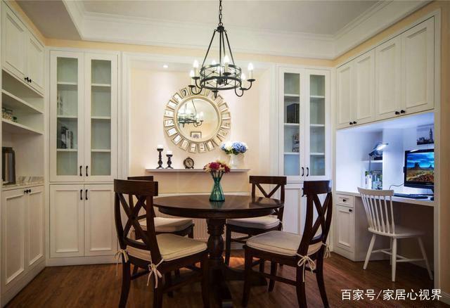
Let’s look at the indoor restaurant. Built-in cabinets are designed on the side walls of the restaurant. The overall function is very rich. The wine cabinet of the restaurant on the front can be used for decoration. On the left is an open display with lockers. On the right side is a cabinet with a desk. The overall design is practical and beautiful, and the small area is perfectly used and very clever.
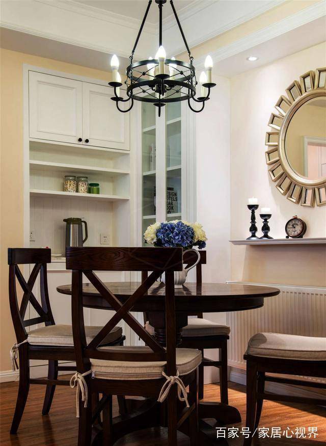
The dark American-style dining table and chairs are retro and beautiful, with floral art on the table and iron chandeliers on the top as embellishments, which increase the fullness of the space as a whole, and the atmosphere is also attractive.
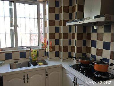
The L-shaped kitchen layout is simple and clear. The wall tiles with rich wall patterns are laid out in a square shape, which is relaxed and lively, which not only enriches the color matching of the space, but also creates a strong atmosphere for the space. The mood will be much better when cooking.

In order to accommodate storage, the kitchen has made a lot of storage designs. In addition to wall cabinets and cabinets, the kitchen wall also has a separate shelf design, and a small shelf is placed in the corner for storage. The kitchen is more tidy after partition storage.
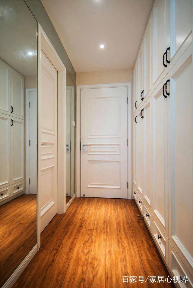
The area of the owner’s bedroom is not large, and the overall internal space is a little tight. When measuring the size at the beginning, the owner decided not to make a wardrobe in the lounge area, and cleverly moved the wardrobe to the entrance “aisle” with a built-in design and opened the door. A row of atmospheric and practical white wardrobes come into view, supplemented by the mirrors on the walls on both sides to expand the space, the overall look is transparent and bright, and the storage capacity is very strong.
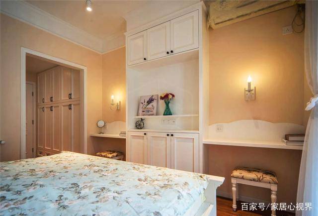
After the wardrobe was moved to the aisle, the area of the original bedroom suddenly became a lot more spacious. Therefore, a row of combined cabinets was made at the end of the bed during the decoration. The two sides can be used as dressing tables and office areas, and the middle part is placed for small accessories and storage. Sundries, the overall practical design is very warm against the warm-colored walls, and the neighbors who visited it praised the practicality.
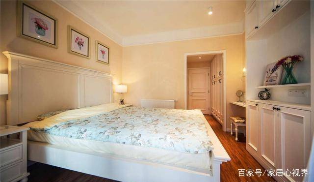
This is the overall effect of the master bedroom. The dynamic and static partitions of the entire space are obvious, and the areas are interconnected and layered. It is beautiful and space-saving, and it is too practical!
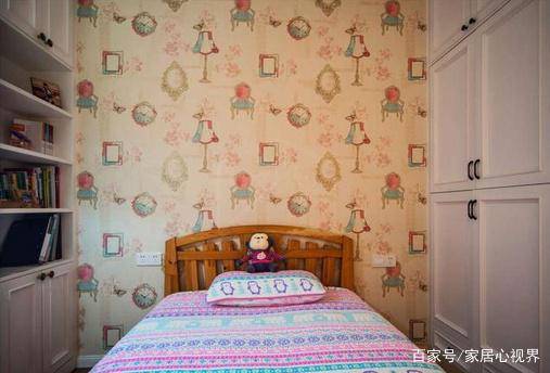
This relatively small bedroom is a children’s room. The space of the children’s room is slightly smaller than that of the master bedroom, but the overall layout is very rich. The walls are covered with colorful wallpaper, and it is more warm with warm color bedding. There are wardrobes and bookcases on both sides of the children’s room, which is convenient for children to store and study.
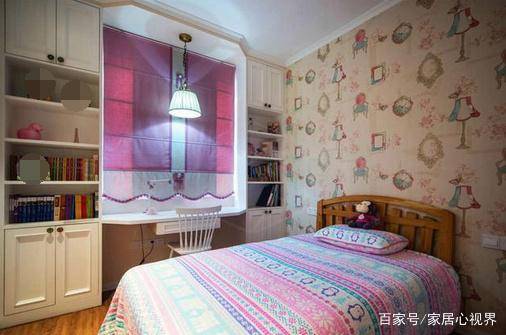
The modular bookcase on the side of the window is very practical. The original floating window sill not only adds a “small study room” after such use, it also perfectly accommodates children’s toys and books. It is also very convenient for reading and learning, and it is really practical.
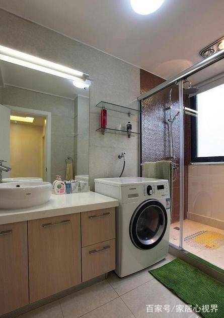
The bathroom space is relatively spacious. The owner uses a glass shower room to divide the bathroom into two areas. The combination of light-colored wall and floor tiles and warm-colored sink cabinets harmonizes the cold and hard feeling of the space, which is neat and warm.
Do you like this beautiful and practical decoration? Welcome to share your views!


You must log in to post a comment.